Mar 09, 2011 MIT Media Lab’s Brilliant New Logo

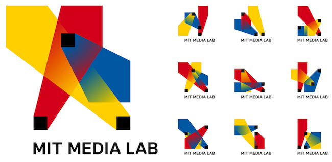
The algorithmic design represents the Media Lab’s first official stab at a coherent identity, and it’s high time. The Lab has transformed from a scruffy operation focused on quaintly enhancing the “digital revolution” into a full-blown brand synonymous with wild experimentation, collaboration, and big-time math geeks. Now, it’s got the graphic design to match.

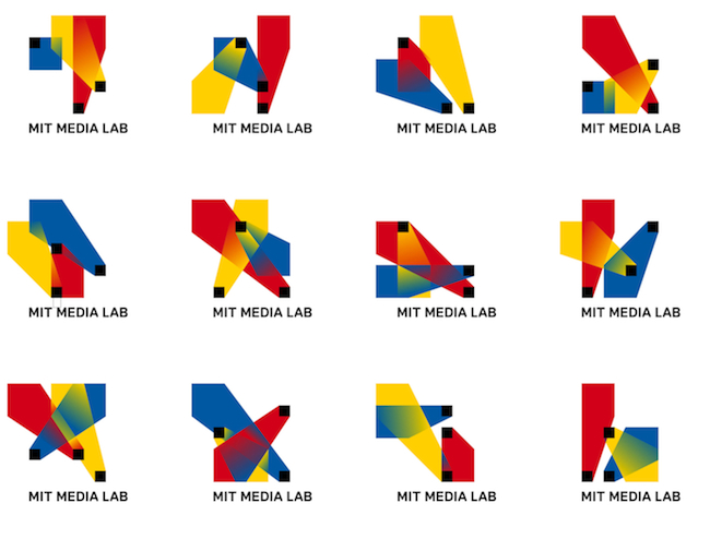
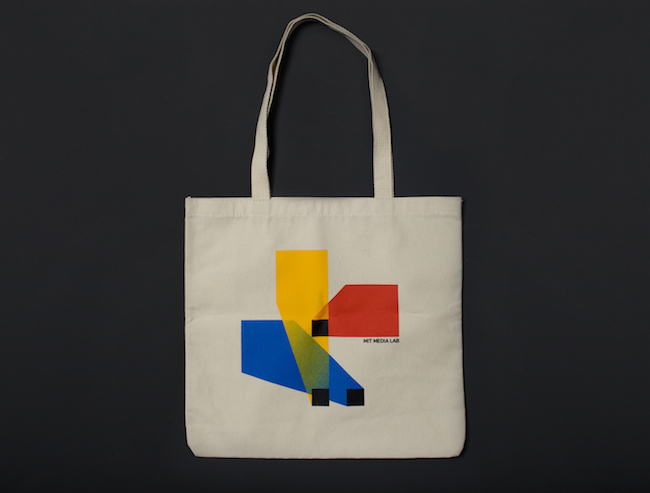
The basic idea here is that the logo has three intersecting spotlights that can be organized in any of 40,000 shapes and 12 color combinations using a custom algorithm. That’s enough to supply each and every new card-carrying Media Labber with his very own logo for a whopping 25 years.

Check out the fill story here


